Responsive Design
New technology opens up new opportunities for design.
I remember not even ten years ago the idea of a "one-size-fits-all" approach to design was a nice idea but not necessary because of the limitations it posed to desktop websites. The desktop-only designers hadn't considered the impact that mobile would have in just a few short years on how to serve up relevant content. There was the camp that thought mobile would be mobile and desktop would be desktop. That just wasn't the case as bridging the gap of retail for example became a canyon when considering data feeds and content refreshes. The trouble is having your data in two different places but acting as one. That's one enormous undertaking that ends up causing headaches and loads of cash. Having started out my career when mobile was introduced and seeing how stubborn some companies have been in adapting to this different platform has been enlightening for me. This is why I feel that responsive design is the most important thing a company can embrace.
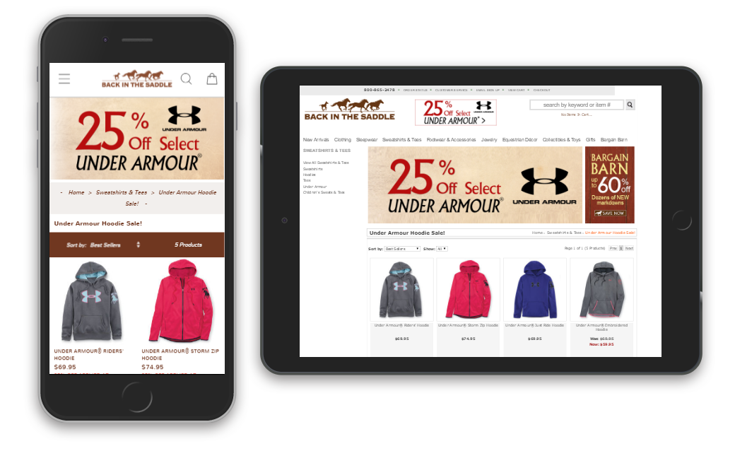
In case you were wondering where I stood as a designer, rest assured that I'm all in for responsive. Here are some ways that I've either helped to make truly adaptive or responsive designs or mobile-friendly designs that speak to the mobile user. It's been a breath of fresh air learning how to let the platform dictate how my designs will look.